sitelen juna tutorial!!1!!1!!1
sitelen juna is a writing system created by jan juna Kulusepelipowi (that's me), probably in 2025 idk i'm not going to carbon date my maths textboox.
ni|li|sitelen|juna|
mi|pali|e|ona|lon|tenpo|sike|nanpa|mute|ale|mute|luka|
this is what sitelen juna looks like (this tutorial is supposed to give you enough knowledge to read this)
please note that the font is garbage
structure
each full sitelen juna glyph is one syllable. glyphs are constructed by placing a vowel glyph on top of a consonant glyph (or multiple we'll get into that later).
i - this is a vowel glyph
m - this is a consonant glyph
when you smash them together you get mi. this block represents one syllable.
a vertical line is placed after each word to separate them (even if the word is the last on the line). in the font, the character | is used for this.
vowels
aeiou
these are the 5 vowels. notice how they all kinda look like arrows? that's because they are. the "arrow" points towards the vowel's position in vowel space (if you have no idea what i'm yapping about don't worry).
if you don't know what vowel space is, all you need to know is that the vowels above are in alphabetical order: a,e,i,o,u.
consonants
- J - j
- K - k
- L - l
- M - m
- N - n
- P - p
- S - s
- T - t
- W - w
these are the consonants, there's some logic behind them which you might be able to figure out but you don't need to know why they look like they do so don't bother
example: meli is how you write "meli". (i know the consonants are hard to tell apart it's a font issue not an issue with sitelen juna)
coda n
coda n is written with a squiggly line underneath the rest of the glyph, like this: lon
(if you don't know what coda n is it's when n is the last sound in the syllable like in "anpa" and "lon")
other things you should know
names are written exactly the same as regular words. there is no equivalent to uppercase characters or cartouches in sitelen juna. as previously mentioned you need to put a | at the end of each word.
handwriting example
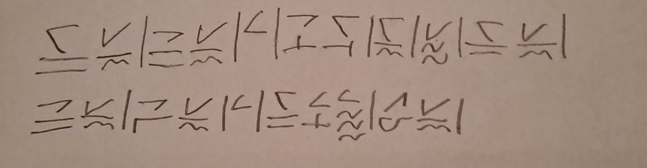
this is what sitelen juna should look like, the font is bad